 Is your UX design perfect?
Does this question make you think twice?
This means there are issues!! If so, then, it is imperative to make the desired changes.
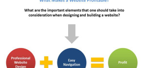
We all know that the website is a reflection of our business. It plays the role of a core anchor in the digital marketing efforts. The website designed with the user in mind is perfect, as it enhances the conversion rate and makes users more loyal to your brand. Even though, the significance of linking with users and establishing relationship most of the times depend on your website UX design.
UX in web design is the procedure of engaging more users by improving efficiency, usability, and accessibility of the website. Remember that, conversion rate highly depends on the UX design of the website. e.
Look at the below stats to lock your decision:
Overlooking the UX does not give more influence on the bottom line and also, does not turn users into customers. Also, the companies that do not give preference to do so lag behind and allow their competitors to stand out. Anyways, have a look at the below statistics:
- It is examined that the user experience in 2020 will overtake the product and price as the main brand differentiator.
- Those who are providing the best user experience can notice a visit to lead conversion with 400% higher chances.
- With a study of the consulting firm and leading research, we came to know that approximately 84% of the businesses can improve their focus on customer experience metrics and measurements.
As we can see that the marketing landscape these days prefers the website as an important tool. We can say that it is a 24X7 Salesman that has the power to be the potent centerpiece and asset of all your marketing efforts.
Improve Your Website’s UX for More Conversion Rate
Prioritize Your Users
Users only approach the website they like. And they stay to perceive knowledgable results. So, what is better than asking them about their requirements and what do they want to see on the website. Involving the users in the process of designing will surely give you better user experience.
Asking users will give you the productive design ideas that you can include without any uncertainty. The ideas can be gathered by starting a Facebook quiz, creating a twitter survey, carrying out a survey after any purchase, and asking the Snapchat users about the snap of their likings and dislikings.
This process not only gives you an in-depth analysis but, also enhances the business social media presence. So, find them now, take a piece of advice from them and provide them incentives when they give a bit. Offering only a 15% off or coupon can work as a reward that you like to give to improve the user experience.
Leverage White Space
White space aims to convert your content in a more readable form. It allows all the users to centralize their focus on the necessary details within the text. White space used around the title and text improves user engagement by more than 20%.
It makes your business website feel fresh, open, and easily understandable. Also, if you will continue using it on your website, then you can easily relinquish your information behind the content to the user.
Consider the case when you want to make a lot of content visible to the user; then using much white space can work for you. It will then show most of the productive information above the fold. Here, you have to maintain the balance between what important is to highlight and what images or text has to be on the top.
Use a Clear CTA (Call to Action) Button
The call to action buttons makes your website to get more conversions. The general CTA used are: Sign up for updates, book a consultation, Start a trial, download the app, etc. It is recommended to use the Call to Action button on almost every page of your website. The studies have revealed that the websites with a definite CTA button have more chances to get more conversion rate.
Also, if you have designed your website in folds, then also, you need to keep the CTAs above the fold to increase its visibility rate. You have to consider some of the main elements:
- Use prominent CTA colors. The colors have the ability to make your website look more appealing. Here, our advice to you is to use contrasting colors than any color scheme of the overall web page.
- The text of Call to Action has to be action-oriented. Do not use the passive verb within the content. Your included text should be detailed and dynamic to assist the users to take the required action immediately.
- The CTA text should not be more than five words.
Page Speed Optimization
What makes visitor frustrating while landing on the web page- the page speed. The website that takes more than usual time to load is not liked by anyone, and they move to another website. It is estimated that the website that takes more than three seconds to load makes users leave the website. You must know that the slow page speed hurts the user’s experience, make them frustrated; usually, the user does not have much time to wait.
So, it is better to improve website speed. What you can do is to compress every image before loading them on the website. The image file is one of the main reasons for the slower website loading speed. You can use the compressor.io to speed up all the pages of your website.
Take a Grip on 404 Errors
Generally, the users land on the page they have searched. Sometimes, they experience a 404 error that also irritates them. And, then they prefer to search for some other website for better service.
You must know that the 404 errors are able enough to make the user run away from your webpage. However, these errors are unavoidable, hence there is a need to get rid of it. What you have to do is to:
- Know which searches are usually displaying the 404 errors, fix them after finding.
- Use some other error message instead of the 404 errors that appeal to the users. Personalize the message and make the experience friendly.
- Include only the pleasing, engaging, suitable, and entertaining images on the error page to reduce the level of irritation.
- Assure the users that you will give them a smooth and comfortable user experience. So, customize the text and give some personal touch to it.
Consider Authentic Images
To make the content appeals visually, add the images. However, we recommend you choose the authentic images only, the kind of images you are using affect the feel of your website. What you have to keep in mind is to avoid using the stock photos. Though, this is easy to use and cheap, but, believe us, it gives more harm to your website.
The authentic images give more visitors a more practical approach so that more users can connect with it. On the other hand, the stock images are old, used by someone, and do not get the user’s attention. The other thing is that the stock photos cannot send with the message to assure that you have not given many efforts while website designing. Even, it will not make the website look unique. So, our recommendation is here is to use the original images only; and it does not matter if the images are simple and basic.
Consider Hyperlink Differentiation
While adding the link to the web page, you demand the user to click there only. Assure that the links are recognized easily with the visual cues. Different colored text and underlined text make the readers engaged and show the user that it is the link that they have to click on.
When it is about hyperlink differentiation, you have to change the strategies. To get the conversions is the only thing that all businesses demand. The best way to test the efficiency of the links is to remove and blur the color from the web design and find how it works. While hyperlinking, do not bother about the length- the longer the titles are, the easy the identification is.
Simplicity and Clarity
The users usually examine the website design in some seconds only. Hence, you have to decide what makes the user engaged to stay on the website for a long. Make it easy for them to get the action buttons. Make the visitors more engaging on the main button versus the button bunch on the home page. Reconsider what your website can do to make it simple to use.
The web design makes it highly usable for more of the users and enabling them about extra functionality and makes everything discoverable, but, do not show it once. The other thing to consider is to make the design more consistent and clear. And, they can also get to know the changes with the website when the colors are reused, the aesthetics and behaviors are changed.
Add Well- written and Well- designed Headings
The content and headings have to be inspired by the requirements of the customers. Do not forget that the keywords of the title are also important for targeting the message and engaging the potential audience.
The search engines particularly give extra weight on the content, hence, selecting the appropriate heading is a must to stand out and to improve the website visibility. What more- the headings navigates the user about the web pages, and make them scan the website perfectly and finding the content becomes easy then.
Be Mobile-friendly and Responsive
Your website has to be mobile-friendly and responsive. Make the website easily navigable and accessible. Nowadays, Google started penalizing those websites that are not mobile optimized.
And, hence converting the website responsive has become more critical. It is surely, the best and the only notable way from where the website usability can increase.
Visual Hierarchy
While placing the critical aspects of the interface, make them highlighted so that the user directly focuses there. Website designing gives you several ways to highlight the main points on the screen.
We have seen many websites that overlook this aspect; they did not highlight the major content and add the “click here” buttons.
Wrapping Up
The best user experience does not only revolve around providing valuable information. It even, make all the content of the web pages more engaging and pleasing. No matter how good your products and services are; if you are not securing the user’s attention than it is not enough!!
So, if you have not improved your UX till now, then do it now! Our tips are here for you. Take leverage from them. And boost up your business now!!
We, hope, our write-up is helpful for you. If you have some queries or suggestions then let us know in the comment section below. Thanks for reading!!