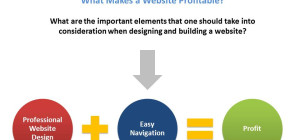
Have you ever noticed how some websites catch your attention and get stuck in your mind? Do you feel like revisiting those pages again? What is it that makes these pages different? Smart usage of web designing techniques by a web design company!
The sole requirement of web designing is to attract web traffic. This intent can be realized using many different techniques. Leveraging typography hierarchy to enhance customer experience is one such technique. Shift your mindset from traditional thinking and adopt an experimental approach. Cramming up your website with content is history. You need to understand the art of typography hierarchy and use it to create maximum impact.
We will discuss the tips and tricks of using typography hierarchy in the later part of the blog. Let us first understand what typography hierarchy is.
Typography Hierarchy: As Perceived By A Web Design Company
Design, be it content or images, is a vibrant and dynamic realm. Top web design companies in USA interpret it as a medium for infusing aesthetics in functionality to create a visual impact. It connects people. Typography provides these designers with a huge scope for improvising. Efficient use of typography techniques can design text on a web page so that it organizes your information, emphasizes the meaning of the text, and guides your readers.
Let us now talk about typography hierarchy. While typography makes text legible, typography hierarchy helps bring user attention to significant details. Using bold letters to highlight a heading is one technique of typography hierarchy. Placing the company’s logo at a prominent position on a webpage is also another example of typography hierarchy.
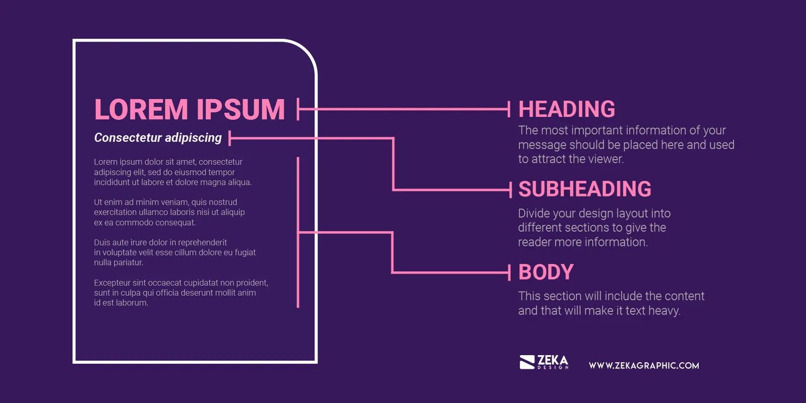
Generally, all text on a web page can be divided into three main categories: the title or the headline, the subheadings, and the body text. The title text is the boldest, the sub-headings are slightly less bold, and the body text is of ordinary size.
Key reasons a web design company leverages typography hierarchy
When a web design company builds a text-based website, how does it differentiate critical information and bring user focus? By leveraging typography hierarchy. The attention span of a user is just 8 seconds. A web designer has to convey critical information within this timespan effectively. By placing such text strategically and enhancing its visibility, a web designer can ensure even a visitor in a hurry has seen and understood the text. Hence, typography hierarchy is essential in determining what the viewer sees first. Let us look at some advantages of leveraging typography hierarchy.
- It conveys crucial information by driving attention directly and instantly to it
- By organizing text properly, it helps viewers navigate conveniently through the content
- Using a particular typeface or font becomes synonymous with your brand and helps create and reinforce your brand identity
- Placement of strategic web elements in a custom website design in NYC also influences buyer decision
But how you use typography hierarchy plays a significant role in determining its output. With a wide permutation of intentional typographic element variations available, a web designer must make the right choice. Let us look at some tips and tricks of typography hierarchy that can help a web design company create visual interest and increase readability.
Typography Hierarchy Tips For A Web Design Agency In NYC
As a web developer, you will agree that every font or typeface you use has a specific personality. You can leverage this personality to create a narrative or tell a story. Subtle, innovative improvements can elevate text and make it more prominent, professional, and meaningful. Let us look at some tips for good web designing in New York.
Gain Content Insight
Skillfully implement typography hierarchy techniques with an in-depth knowledge of the content to be designed. When conceptualizing the content design, wisely get into the head of your targeted audience to understand how they intend to interpret and interact with it. Make subtle use of cues to guide the audience. Explore innovative techniques to create impactful visual communications.
Content knowledge helps a web design company to understand critical points to highlight and their relative importance to the message the overall content wants to convey. It can elevate the reading experience and make it smooth and effortless. Hence, understand, think, and visualize how you want to place your content.
Separate paragraphs from sections
Create the right mood by improving the reader experience. Separate individual sections from paragraphs to prevent an unending marathon of content. Spacing between paragraphs and sections allows for a moment of pause, making the reader think. They also make the paragraphs seem less intrusive and in harmony with each other.
Choice Of Fonts
An intelligent font choice will set the right tone for your content. But with many font families available, it is easy for you to go crazy. Hence, restraint is vital. Choose fonts that blend in with each other to create harmony and impart consistency to your content. All headings, subheadings, and body text fonts must complement each other.
Once you select the font families, choose the font weights. In an ideal custom web design in NYC, font pairings work cohesively without competing with each other.
Keeping the font hierarchy intact helps readers and viewers extract the right meaning from the content. For example, the headings are the largest, the subheadings are smaller than the headings, and the body text is uniform. A visual contrast between the font pairings creates a hierarchical separation. Ensure your headings and subheadings align with the corresponding content, leverage white space to add breathing room, and make the text scannable.
Following these rules helps your information architecture gain a logical visual representation that underscores readability, content comprehension, and retention.
Usage Of Typefaces
Implementing more than two typefaces can clutter your website content and distract your reader. Hence, as a thumb rule, the top web designing companies in USA use a typeface for the headings and another for the body. If you think logically, you will realize that large-sized typefaces attract our attention first. Leverage this psychology intelligently to maximize the typeface and font pairing in your website design.
Spacing And Alignment Check
Margins are critical to separating content from each other. They help a web design company align text consistently, creating visual harmony. Further, margins create negative space. You can use this innovatively to keep users focused on the main content. Asymmetric or varying margins make the text interesting by giving the overall text design flair and dynamism.
Spacing and alignments are aesthetic elements that you can manipulate creatively to add an element of drama and energy to your text, thereby enhancing its visual interest.
In Conclusion
Typography hierarchy is a renaissance of contextual creativity in the modern age. With impactful visual communication the key to improving conversions, a web design company must harness its power to achieve sustainable results. An abundance of compositional typography hierarchy techniques helps web designers inform, interest, persuade, and inform users with strategically designed content. However, leveraging the above tips empowers them to skillfully apply them and unlock professional opportunities for their clients.
Post by:https://www.unifiedinfotech.net/