
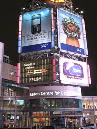
 In the City That Never Sleeps, opportunities for billboard advertising seem almost infinite. With all of that competition, billboards in NYC need to go the extra mile to stand out. While you may not be advertising to the 360,000 people in Times Square every day, you still need to be smart to steal eyeballs off of someone else’s ad and get their attention on yours. Let’s take a look at nine tips for creating eye-catching billboards.
1. Tell a Story
You can grab attention by telling a story, but you’d better make it a short one. Not because everyone in New York has somewhere they need to be (though they do), but because most people only glance at a billboard for about five seconds.
Fortunately, that’s all the time a great ad needs. The best way to tell a short story isn’t with words, though. It’s with images. Great visuals catch the eye and can be understood almost instantly. Since your text will be minimal, the image genuinely has to carry the idea.
2. Keep It Simple
Since time is at a premium when people are looking at billboards, a complicated idea just isn’t going to cut it. Strip it down to its essence. Large, bold, easy-to-read fonts are a must. Use high-contrast background colors to make your text readable quickly.
Another tip is to think of how your billboard contrasts with the environment around it. If it’s located in the midst of grey and black buildings, use bright colors instead of grey tones.
3. Capitalize on Its Location
You can gain extra traction by using local references in your advertising. Everyone loves to get a shout-out, and billboards in NYC have plenty of references to draw from. You can get the audience on your side quickly by commenting on current events, sports teams, weather, traffic, local humor, and the list goes on.
4. Stick To One Main Idea
This isn’t the time to promote every product or service in exhaustive detail. You only have a few seconds to get your message across, so pick one strong idea and run with it. If you’re running a campaign, you can always feature some of your other products or services as part of a more complete picture as time goes on.
5. Shorter Is Better
With viewing time at such a premium for billboards, you can’t afford to be wordy. You should cap the number of words at 10, and that includes your company logo and slogan. Your headline should be seven words or less. That’s not a lot to work with, so make it count! Using short words will also help make your billboard quickly understandable.
6. High Contrast Colors
Some colors work together better than others. Newspapers are a great example of high contrast; black on white or white on black are both high contrast examples that are quickly and easily readable. Avoid pairing colors that are too close in value, such as yellow and orange or blue and purple. You want your billboard to be visible from as far away as possible, and non-contrasting colors defeat the purpose.
7. Images Rule
As with your text, your image has to be understood almost instantly. It’s better to make a small object large and detailed for a billboard in NYC than to make a large, detailed object appear small. Complex images that require more than a glance will work against you. Avoid using more than three visual elements, keeping it down to just an image, a logo, and a headline.
8. Make Every Square Foot Count
There’s no room for unused space on a NYC billboard. While other forms of advertising can get artsier with the use of negative space, there’s no room to play around on a billboard. Elaborate designs need to give way to direct images that make full use of the limited space.
9. Large, Clear Text
Since you need your billboard to be readable from as far away as possible, your text needs to be large and easily read. Using bolded upper and lower-case non-serif fonts can help this along. Fancy fonts and thin letters are harder to read on a billboard even if they look great on paper.
Billboards have been around for a long time. The Associated Bill Posters’ Association of the US and Canada was formed in Chicago in 1891. They’ve come a long way since then. And, despite massive advances in technology, the basic requirements remain the same. Even the fanciest digital billboards still only have a few seconds to be understood. They largely have to obey the same rules with concise messaging and high-contrast visuals to succeed.
Even in an age when advertising reaches more people in more ways than ever before, billboards remain one of the most cost-effective, and effective, ways to advertise.