
 Graphic design is an artistic field that is growing right along with the current boom in all things tech. Breaking into that field and creating stunning designs does require a background or at least a basic understanding of some core artistic principles. Designers create layouts based on the principles of design and the elements of art such as form, implied texture, and balance. Chief among the elements of art is colour. Choosing the right combinations can be the one thing that really causes a graphic to jump off the screen at viewers.
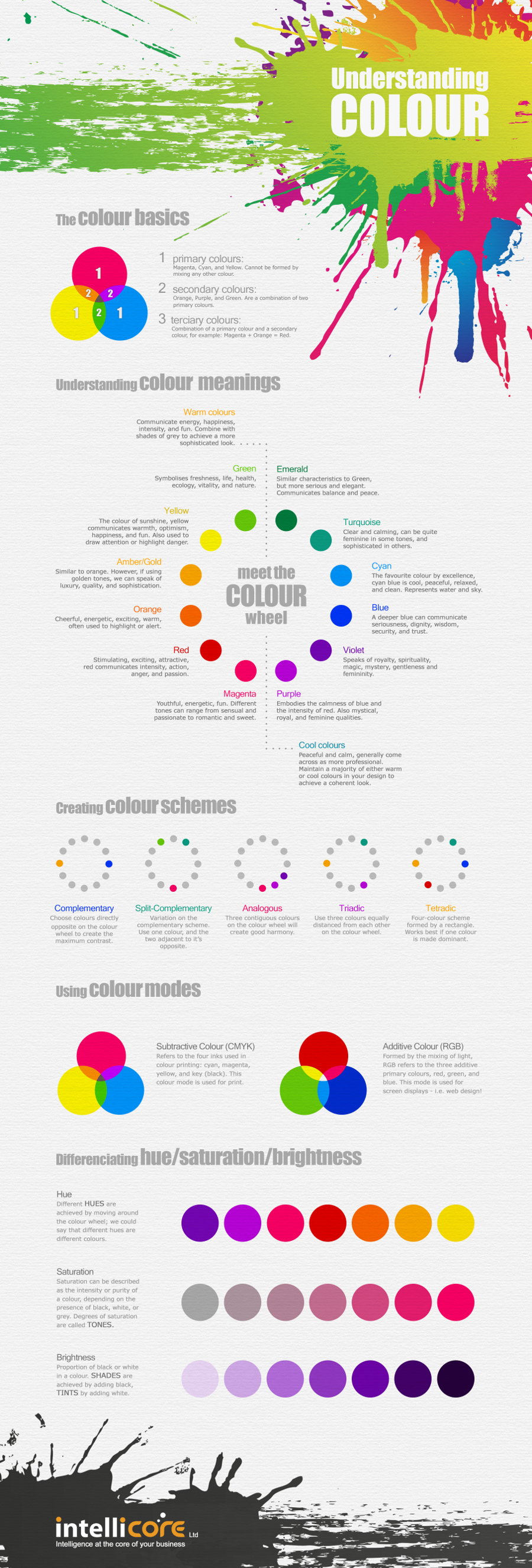
Colour basics begins by getting three terms under your belt: primary, secondary, and tertiary colours.
- Primary colours are those that cannot be formed by mixing other colours together. In terms of graphic design, we are talking about magenta, cyan, and yellow.
- Secondary colours are those that are a combination of the primary colours, including orange, purple and green.
- Tertiary colours are formed by combining secondary and primary colours. Again, with graphics, an example would be combining magenta and orange to form red.
All of these colours can be broken down into two additional categories that possess the ability to elicit certain feelings in the viewers. Warm colours such as reds or yellows can effectively communicate energy, love, happiness, or excitement. All of them can be found on the left side of the colour wheel. The colour wheel is simply a circular, graphic representation of all of the colours described above. Primary, secondary, and tertiary colours are placed in their respective position. The cool colours such as purple and cyan are found on the right side of the wheel. The colours can provide sensations of peace, serenity, or calmness. In general, most designers feel that the cooler colours tend to reflect a more professional appearance when it comes to producing images.
Designers begin creating their image by taking the appropriate colours and devising what is known as a colour scheme. A colour scheme is a way of describing the relationship between the given colours they are using on the colour wheel.
- A complimentary colour scheme will use two colours that are opposite one another on the colour wheel, allowing for the most contrast.
- An analogous colour scheme will use three colours on the wheel that are right beside each other. This technique allows one to create a feeling of harmony.
- Triadic schemes will take an approach in which three colours that are equally distanced from each other on the colour wheel are used.
Hues, or colours, can have different levels of saturation and brightness. The saturation can essentially be described as the relative intensity of a colour. The presence of levels of black and white mixed with a colour can affect this quality. Mixing in black and white will give one different tones of the original colour. The proportions of black and white in relation to the presence of the original colour can impact the resulting brightness of a colour as well. Finally, designers must consider whether their end product will take advantage of subtractive colour (CMYK) or additive colour (RGB). These terms will affect how the pigment is utilized in the final appearance of the image. In general, CMYK is used for printing work while RGB is the best configuration for graphics on the web.
Here is a nice infographic briefly explaining the points discussed above.
This infographic was brought to you by Intellicore of Aberdeen, Scotland, specialized in Web design, Microsoft Dynamics CRM and mobile development.


![Responsive Web Design Trends in 2015 [Infographic]](https://lerablog.org/wp-content/plugins/wp-thumbie/timthumb.php?src=http://lerablog.org/wp-content/uploads/2015/04/responsive-web-design.png&w=300&h=140&zc=1)