
The jury rages between the seemingly eternally unresolved debate on determining the best layout for designing emails- multicolumn or single-column.
While ultimately, the users are the best judge of whichever layout you choose to go with, there are a host of benefits associated with the single-column layout wherein the meaning is definitely the same as the name suggests.
In the blog that follows, we will discuss the benefits of keeping things simple in your email design, things to look out for, and ultimately decide which layout works best for your brand!
Decoding the meaning behind one-column or single-column layout emails
In design terms, you just put all the email elements (copy and images) in the full width of the emailer (a container, if you may) without any side-by-side stacking up. For instance, let’s look at the email below.

All the elements, right from the image at the top to the copy written in the F format, are laid out in a single column along with the easy-to-access CTAs. Super easy on the viewer’s eyes and scrollable, it’s a clear winner and will render well for mobile users, too.
Here are some eye-opening stats
- Even if your email has great content, if it loads incorrectly on mobile, it stands to get deleted within three seconds!
- Email mobile opens are responsible for at least 50% of all opens.
The takeaway from this is that no email marketer can afford to ignore the segment that resorts to checking emails on their smartphone. This is where single-column email layouts come into the picture.
Here are some other examples of stunning single-column emails!
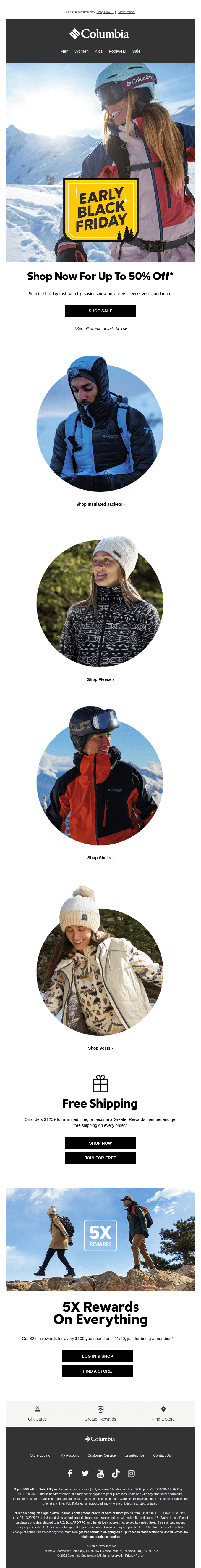
In the above email by Columbia, the single-column layout is not just aesthetically pleasing and easy on the eyes, the CTAs are also strategically placed beneath the relevant images.

The above cart abandonment email by Whiskey Me makes it irresistible to drop everything and get tipsy on a Friday night with its neat single-column design and easy check-out option.
Pros of using single-column layouts in your next email campaign
Since more than half of all emails are read on mobile screens, you would want to optimize design layouts that are easy to consume on such devices, the CTAs are accessible and clickable, and the elements are stacked in a way that’s easy to comprehend and scroll through. They should also render similarly on desktops. Pardot responsive email templates exemplify all these attributes.
Now, let us look at some reasons why people love single-column layouts;
- Simplified graphics: Lesser burden on graphic designers than working on multiple-column responsive emails; these are quite the Godsend! For instance, if one can begin with a width of less than 480 px, we can get a single version of the email, which will render equally well on both mobile and desktop versions.
- Lesser technicalities to look into: For starters, we will use a single table (<table>) for easy adaptability of the content across screen sizes. Also, since elements already load in an orderly fashion, one below the other, there is a marked reduction in the use of media queries. Not to mention no more column mixups because there is only one, to begin with! Since there are fewer blocks to look into, the lesser the chances of HTML code errors. This, in turn, reduces the weight of the HTML code. You can also be assured of support across email clients.
- Ergonomic for users: When attention spans are dwindling like a house of cards, as a marketer, you try your best to provide the most important piece of attention at the top; with single-column layouts and clear content hierarchies, you accomplish that and a lot more. You also have the freedom to enlarge text fonts and spaces, making scrolling a lot more intuitive. This translates into enhanced readability and better click-throughs.
The other side to the coin ~ Looking at the potential downsides
So far, so good, but does that mean multiple-column layouts are obsolete? Well, not really! Here are some of the counterclaims that netizens and developers come up with.
- When accessed on desktops, single-column layouts could,
- Appear super-sized or extra large in terms of text and clickable buttons
- A whole lot of white space on either side of the email
- Potentially exhaust subscribers as they scroll down vertically to the end of the email
- When one uses multiple-column layouts, one has the option to lay out content blocks in an attractive manner. You can always choose to experiment with a hybrid layout if you want the best of both worlds.
Summary
In conclusion, it’s always best to let the users engage and test it out before you decide what works best for your brand. A/B testing comes in extremely handy in this scenario! If your target audience lies in the younger segment (less than 34 years of age), chances are high that they will be checking their emails on their phones. In that case, single-column layouts might be your best bet. If you are looking for professional help in curating your best-ever email campaign, do drop us a text, share your ideas, and we will be happy to help!
Author: Kevin George is the head of marketing at Email Uplers, that specializes in crafting Professional Email Templates, PSD to Email conversion, and Mailchimp Templates. Kevin loves gadgets, bikes & jazz, and he breathes email marketing. He enjoys sharing his insights and thoughts on email marketing best practices on email marketing blog.