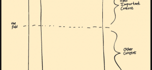
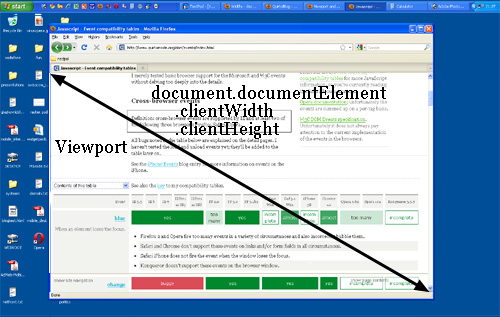
One of the most important aspects in designing HTML pages concerns the width and height of the website and how the elements fit into the layout. Over the years, web designers were looking to have a balance between the benefits and the pitfalls of addressing one or another option or mixing them. In brief, there are several types of layouts so let’s get an in-depth look in the following rows but first let’s see what a viewport is. A viewport represents a rectangle that defines the size of the rendering area (in other words the size of the surface in a web browser dedicated to display the web content.)
1. Relative layouts-its size adjust itself according to the viewport or the visitor’s screen resolution. Such layout relies on percent values.
2. Absolute (fixed) layouts-are based on the absolute measurement of the page (in either inches, centimeters or millimeters). Due to the various screen sizes and viewports, this layout was slowly abandoned in the last years, being now almost entirely used in printed newspapers.
3. Scaled layouts-is a technique introduced with CSS3 supposing the manipulation of the viewport according to its size and orientation. Scaled layouts are merely used for the mobile versions of webpages, those made for mobile devices (tablets, smartphones, etc…) that feature both the portrait and landscape screen orientations. This type of layout is not based on measurement units but in specific characteristics imposed by mobile devices particularly.
4. Elastic layouts-actually represent the most used method of designing web pages. Such layout adapts itself to the size of the content, scaling images and texts for the best possible online experience. Even though it’s a very flexible structure, such issues with the viewport could appear that could lead to undesirable horizontal scrolling on small screens.
5. Fluid (or liquid) layouts-make use of percents as measurement units; they are the opposite to the absolute layouts, filling all the available space on the viewport. They are very popular and used by major websites including Google.
6. Equated layouts-represent a new specification based on the CSS3 “calc” function that isn’t still fully implemented. This type relies on relative heights and widths determined by the calc function (i.e. calc(10%-100px)).
7. Hybrid layouts-represent a mixture of the previously defined types; they are widely used because of the ability to make web pages more flexible regarding viewports and screen resolutions.