
 Infographics is an art! It is a unique and quite elegant combination of graphics and written data. It’s a visual representation of information that is eye-catching and more effective. More effective due to the speed at which information is digested as most of the talk is done via the images instead of the words! Complex ideas and deep information presented in a systematic graphical representation – this means an Infographic. It is changing the current trend of the way people perceive and understand stories they come across while surfing.
Infographics have been present in our lives for centuries! (Remember the painting done by cavemen?) It is everywhere in our world. Go left. Go right. Bump ahead. Beware of dogs. Park here. No parking. No smoking. Danger ahead. You cannot take a walk out of your home and not see at least 5 different signs that convey some information to you. It’s good to know the online world is catching up on the drift and taking advantage of this amazing new way of representing ideas.
It’s a blogger’s heaven if the reader can understand the whole point of the post just by looking at a picture or an image aided by a few words maybe, in the first one or two minutes of landing on his post. Now, who wouldn’t want that? It is especially for us to understand how to create such useful and interesting posts using Infographics so that the readers can keep reading (!) faster.
What is the best way to create a masterpiece painting? Nobody knows the answer to this question. It’s an unfair question after all. Painting is an art. How can there be one specific way to create good art! Well luckily for you there is a way to create great Infographics! At least a way to understand the basics of how to create it so you can then let your imagination go wild and create your own masterpiece in the world of information exchange.
Here are some cool tips to get you started on creating a great infographic. Use them to get started and then let your imagination run wild.
Dig in! ☺
1. Get an idea
You need to have some story; some ideas to write about then you can create an Infographic about it.
2. Research on that idea. Make it more real.
- Define the field of your idea (Arts, science, business, tech, online, web, and marketing .etc.)
- Search and collect data related to your subject (definition, advantages, disadvantages, usage… anything and everything you think you can get your hands on)
- Talk to experts in the field.
- Make notes
- Sort out and separate facts, opinions, doubts, contradictions, myths. (believe me, it’s damn important that you do this)
3. Get Creative!
Search for innovative ideas to represent the data you have collected or that you want to represent. (This works better if you have followed the second step to the point)
Decide the type of images/graphics to use. Visual aids can be thought of or found according to the genre of the subject you are writing on.
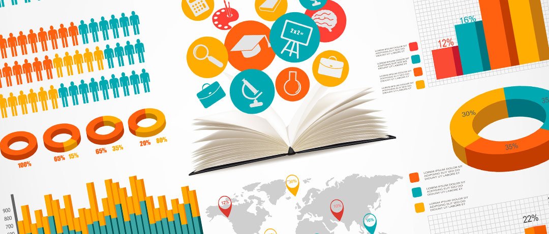
- Graphs. (business reports, trends, scientific comparisons, population reports). Once you decide you want to use graphs you can get more creative in the type of graph that you use (bar, pie, line etc.).
- Colours. Choose colours appropriate to your content. Colours can also be used to represent data. Maps, the popularity of any product or use of any service, representing any demographic, frequency, density, scarcity and many more areas that can be represented better by comparing or sorting them out with colours.
- Characters. You can use different characters too in your story. Plus point is if you are making a point you can give expressions to your characters. Make them feel what you want your readers to feel. Pictures can do what words sometimes cannot.
- Representation of the graphics itself. You can make it perfect using any image tools or you can make it more informal by using hand-created or even with tools you can create graphics with wavy lines. This part is entirely up to you. Choose what best suits your content.
- InfoApps. Use real time data to create interactive Infographics called InfoApps. For example, you can use real-time information on weather conditions and provide a map that changes values according to the real-time data and give an Infographic that is updated every minute!
- Textual Information. Along with graphics or to further elaborate your point you can use numbers, percentages, words, etc. In your infographic. Make sure it’s just for making your point clear with the graphics.
- Images. You can use a real person or real building or any other real picture in your graphic as long as it doesn’t break any copyright laws.
- Maps. Maps can be used extensively in weather-related or sites that are representing any information related to geography, census, population etc.
- Creative commons. You can use the vast repository of creative commons to use in your Infographics. Wiki commons is one such place to get creative and free commons.
- Shapes and figures. You can use different shapes like circle, rectangle, arrows, and also figures that make your point go across.
As per your skills and availability of resources, you can make a rough draft on paper first and then digitize it or you can use various drawing tools and create in that directly.
You can use various readily available tools to create infographics.
These points are just to get you started and going in the right direction of creating simple Infographics. The more you research and put down on paper is better for your Infographic. Remember… make it simple, clear and precise!
A post contributed by https://meetanshi.com/


